


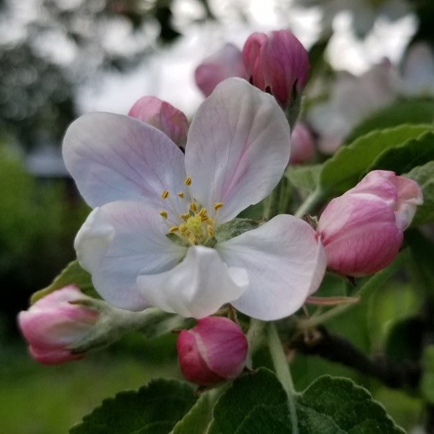
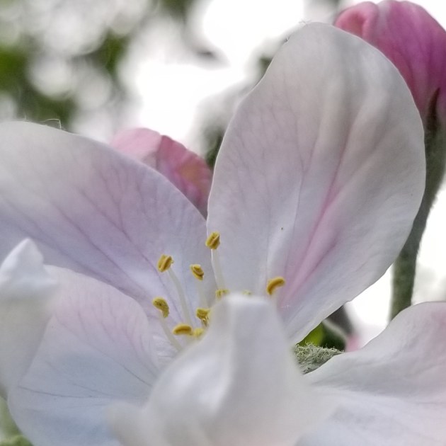
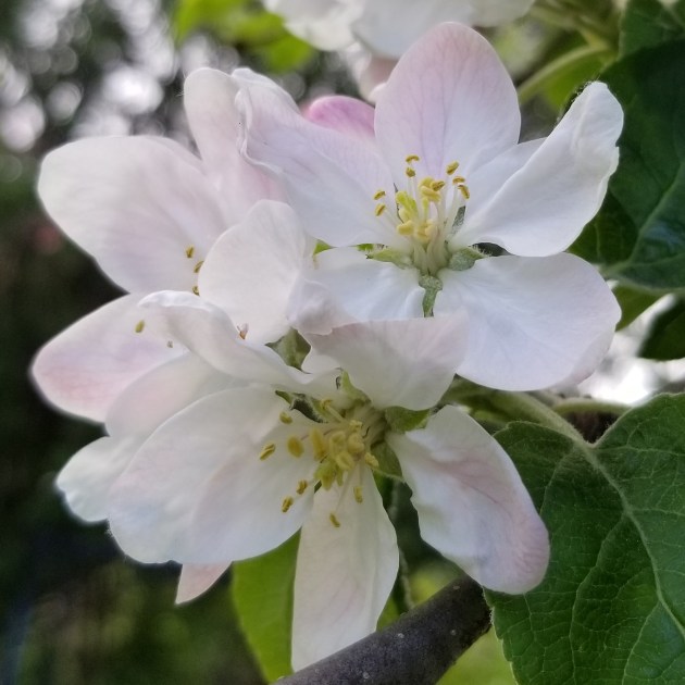
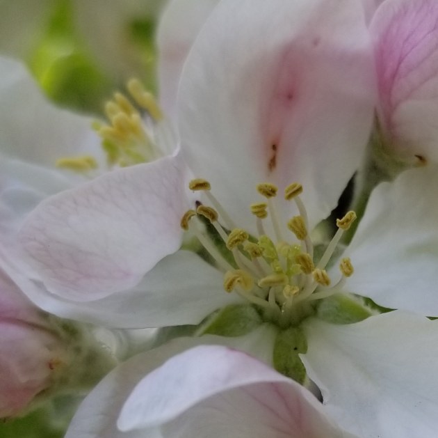
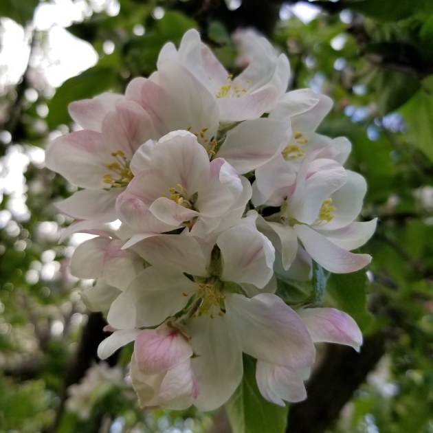
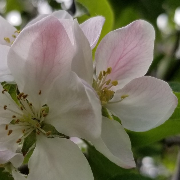
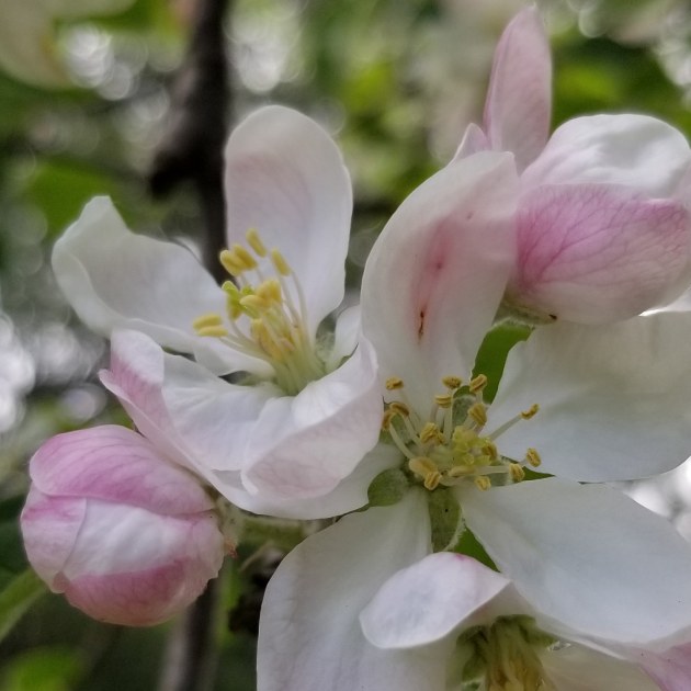
Apple blossoms in spring. Glorious!


Art is as intrinsic to modern life as it was to cultures thousands of years ago. Whether an evocative painting, a whimsical installation, stunning architecture, music that creates gooseflesh, a film that leads you to unabashedly roar with laughter or quietly weep in a theatre of strangers, a book that makes you miss your stop, or the performance that inspires both awe and connectedness, the soul value of art is priceless.
It is at the root of our curiosity and our creativity; one naturally feeds the other. Art enhances our ability to maintain delight in the everyday as well as the extraordinary. Art is not an esoteric kingdom where only the well-heeled can live; it is the essential joy of expression – the pride on a child’s face when revealing a masterpiece in crayon.
Art provides experiences that can change your perspective on life, history, nature, the universe (your pick) forever. That’s about as fundamental as it gets on this human journey. We value art because it is how we discover, define, and celebrate life.
Why, suddenly, do people hate the comma? Did one force some clarity? Did an em dash add something cheeky? Did an apostrophe possess an unsuspecting subject?
Fear not, punctuation marks; I will defend you. You are full of character. You accentuate. You applaud! You provide context. Where would we be without you? Lost, confused, disorganized, and in a bit of a muddle, I reckon. Let’s take a look, shall we?
“I like eating, the smell of summer rain, and my pets.”
Without the commas: “I like eating the smell of summer rain and my pets.”
I beg your pardon?
The semicolon need not perplex; rather, it gives pause. It aids contemplation. We don’t pause enough in our rapid world. Thank you, semicolon, for reminding us to breathe.
Colons create drama and suspense: they are the orchestra leaders of the English language. When you see one, you know something big is coming next, like a crescendo of fact or a list of reasons.
And there’s the em dash, that lively and vibrant storyteller, giving us hints and peeks, like an actor turning to the camera and winking. Some people dislike them—thinking them vain or disruptive, perhaps—but I think they’re dandy, like a conspiratorial sideways glance.
Exclamation marks have never been more popular, often used in an attempt to be heard over the din of voluminous content saturating our existence. But even they are losing their spark due to overuse. We might as well just go back to the period.
People. Like. To. Use. Periods. Like. This. For. Emphasis. Such a method works well on occasion, particularly for irony. Periods cut to the chase and draw conclusions. We need them. Full stop.
It’s the lowly comma, sadly, that appears to be most at risk of an untimely death. I, for one, still love what it can do.
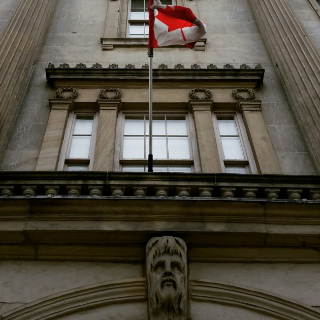
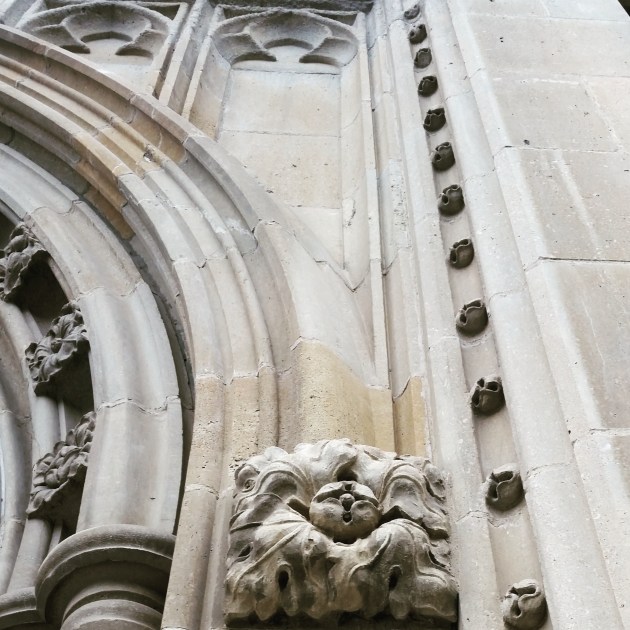
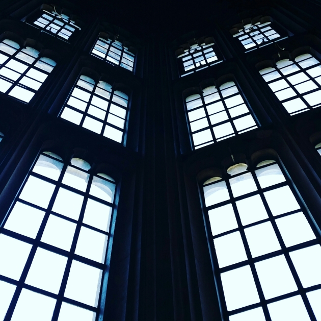
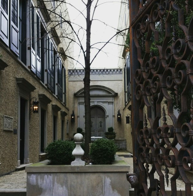
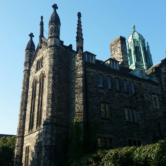
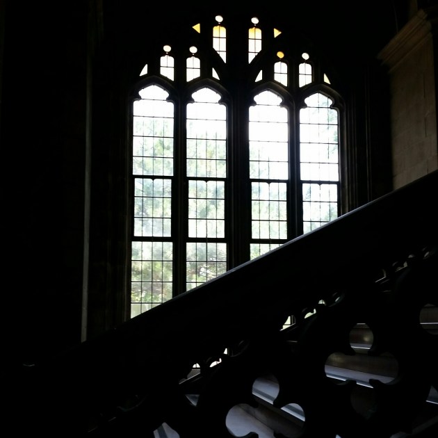
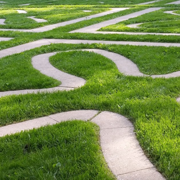
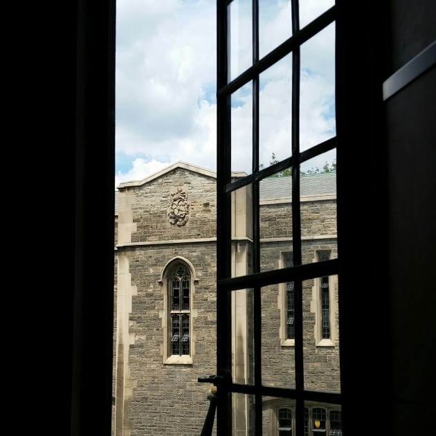
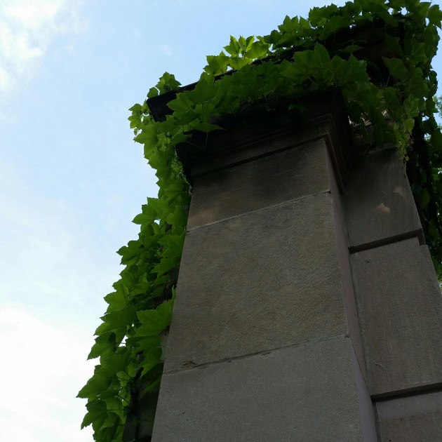
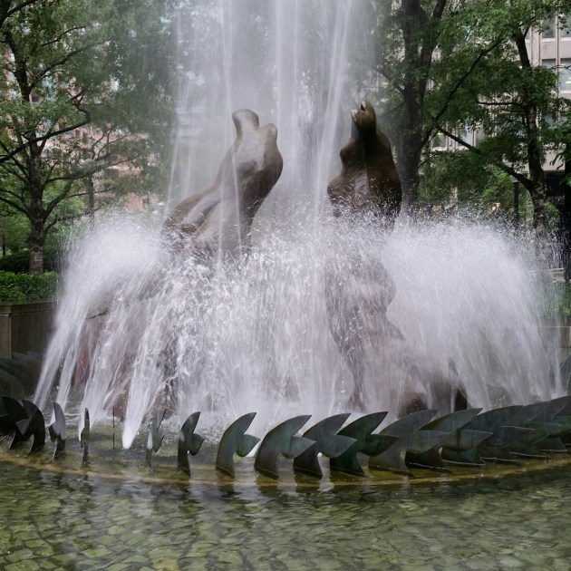
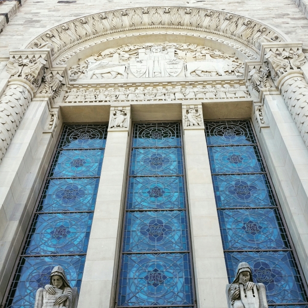
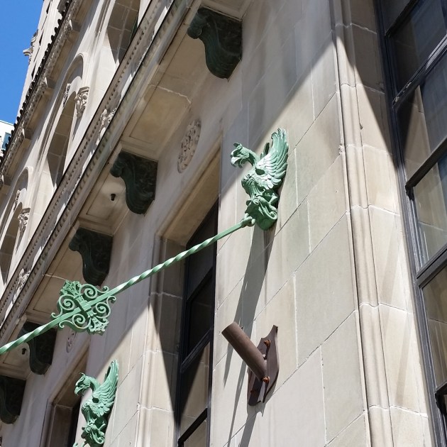
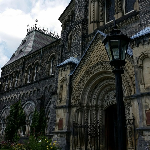
There are many splendid architectural creations in Toronto. Here is a small sample of some of my favourites…I think it’s clear that I’m a proud University of Toronto alumna!
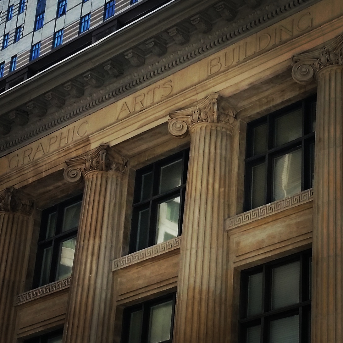
Graphic Arts Building

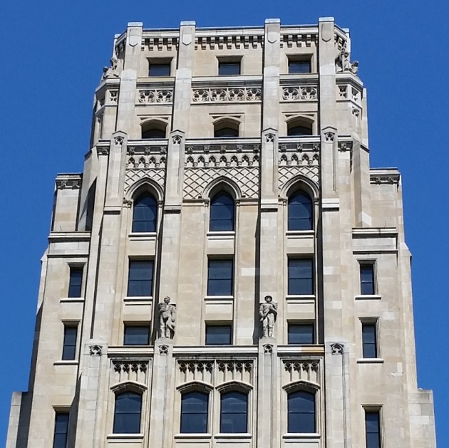
Toronto Old City Hall Clock Tower
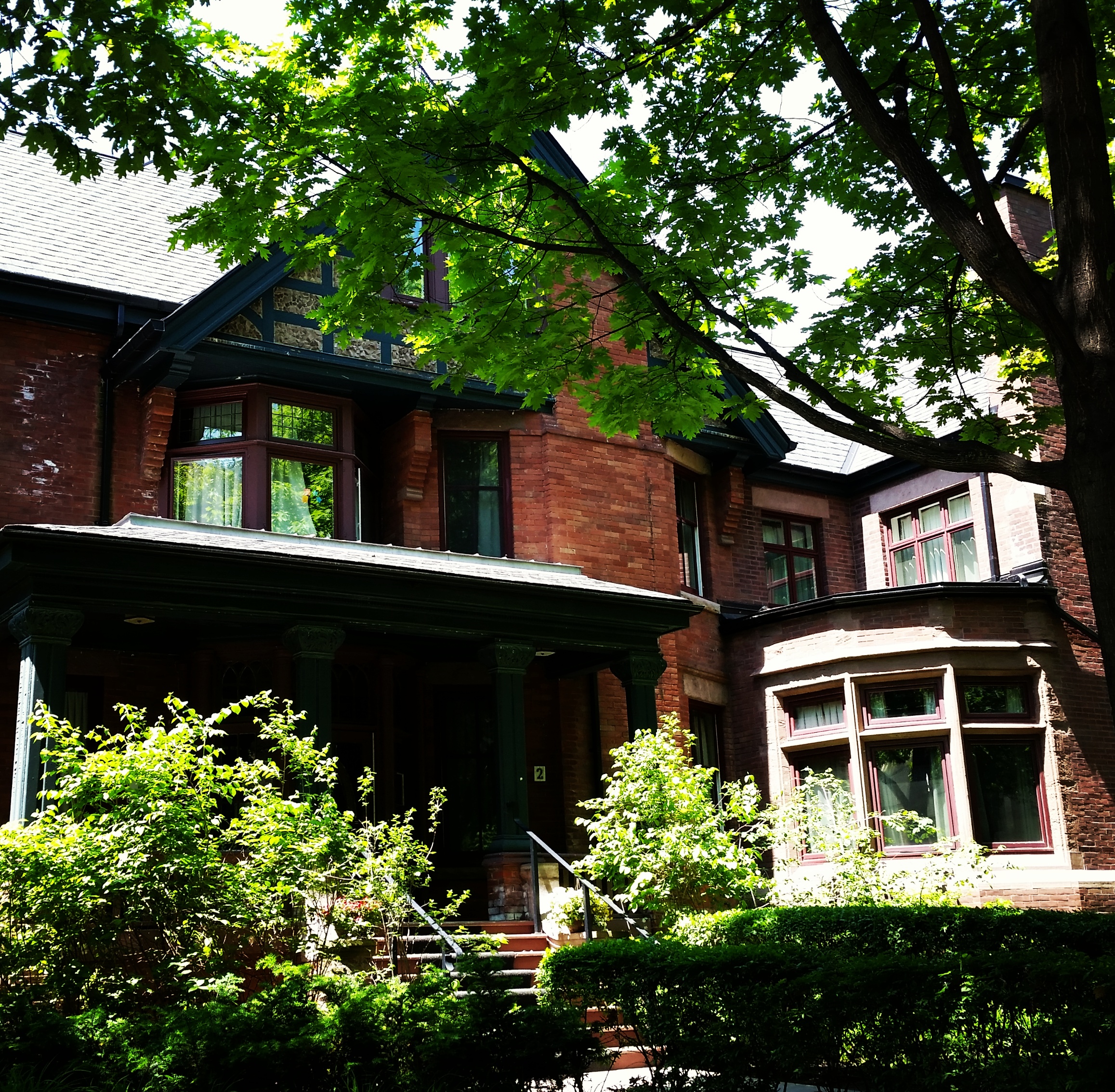
University of Toronto, St. Michael’s College, Elmsley Lane

University of Toronto, St. Michael’s College
Whitney Block, Government of Ontario Building
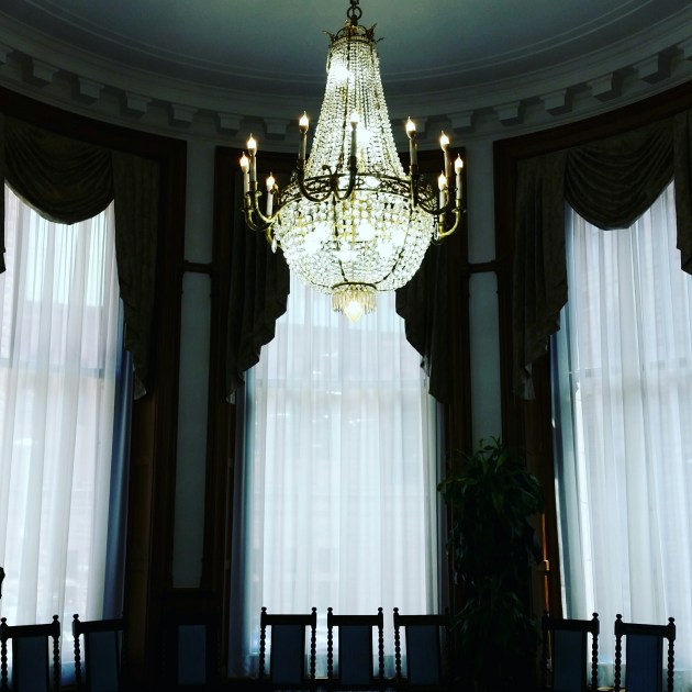
Lieutenant Governor’s Suite
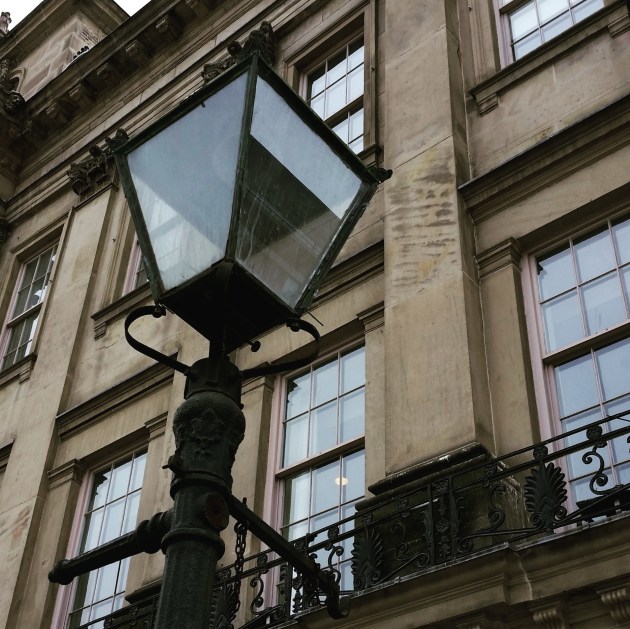
King Street East
King Street East
Whitney Block, Government of Ontario Building
Hart House, University of Toronto
“Provence in Toronto” as I call it (Yonge Street near Rosedale Subway Station)
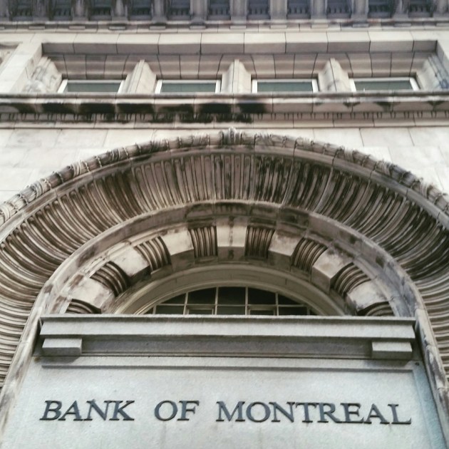
Bank of Montreal Building

Toronto Harbour, as seen from the Centre Island Ferry

Riverdale Farm

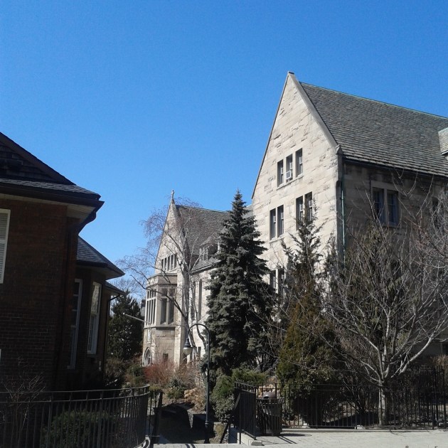
Trinity College, University of Toronto

St. Michael’s College, University of Toronto
Trinity College, University of Toronto

Trinity College, University of Toronto
Trinity College, University of Toronto
Trinity College Courtyard, University of Toronto
Hart House, University of Toronto
Bennett Gates to Philosopher’s Walk, University of Toronto
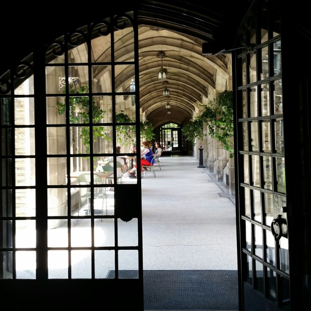
Cloisters, University of Toronto
“The Three Graces” by Gerald Gladstone, 1971 (in front of Macdonald Block and part of the Government of Ontario Art Collection)
Royal Ontario Museum

King Edward VII statue in Queen’s Park

Ontario Legislative Building

Toronto Old City Hall

Ontario Heritage Centre, Adelaide Street

Rosewater Room facade

Fairmont Royal York Hotel
Fairmont Royal York Hotel

King Street East

University College, University of Toronto
Philosopher’s Walk, University of Toronto
University College, University of Toronto
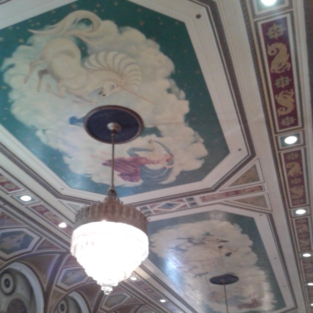
Ballroom ceiling, Fairmont Royal York Hotel
St. Michael’s College, University of Toronto
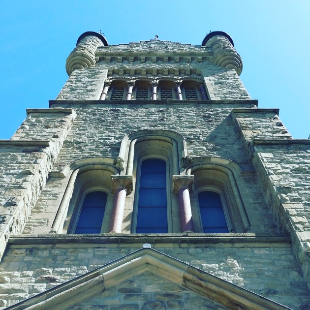
St Andrew’s Presbyterian Church

St Andrew’s Presbyterian Church

St Andrew’s Presbyterian Church
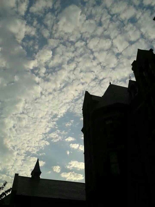
The Royal Conservatory of Music Castle in silhouette
An extraordinary exhibition. Hard not to fall in love in the presence of such beauty…
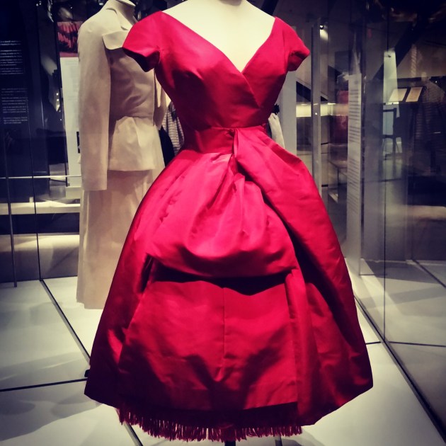


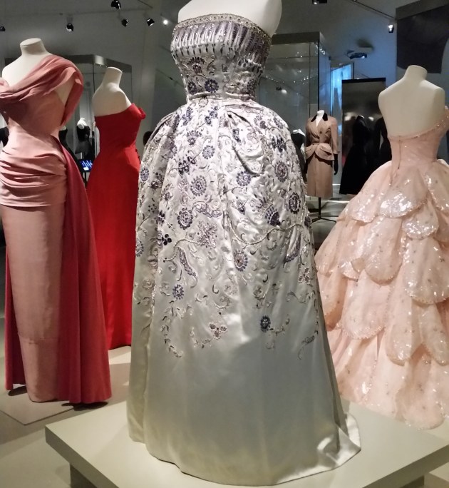

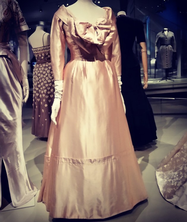

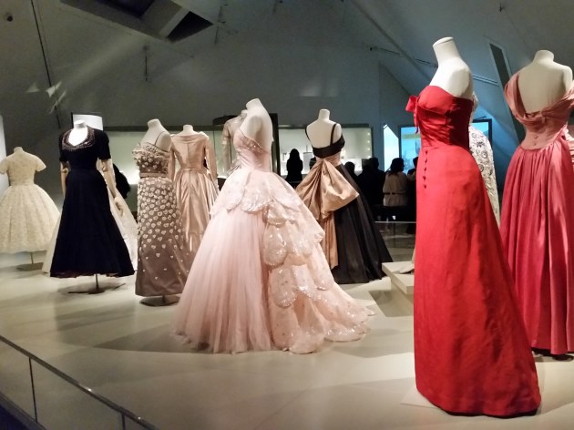
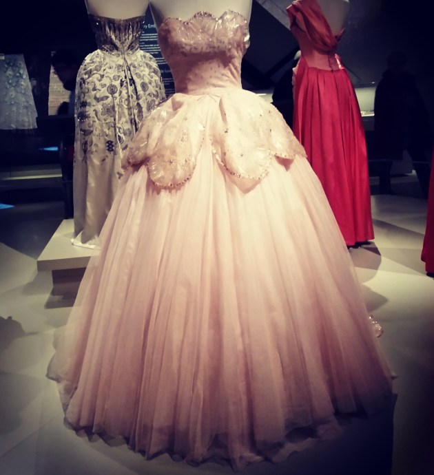


“As a rule, I would say use jewellery generously to get the most out of it.” (Christian Dior, 1954)
Never underestimate a moment:
in the wink of an eye, the brush of a butterfly.

You interrupted
our pages of din
lines between stations
your words between lines
We leapt to judgment;
our verdict tension
And yet there it was ~
your ballet of hands ~
as graceful as dawn.

I really ought to put pen to paper and send some thoughtfully composed lines to friends. My handwriting, alas, has deteriorated significantly over the years. These days, I must concentrate to make my scrawl simply decipherable, let alone artistic, though mine never compared to the wondrous curves of one friend’s cursive or the modernist angles of another’s. The latter friend attended school in Switzerland when we were teenagers and I delighted in receiving her well-travelled letters, living vicariously through these chapters of her overseas escapades and eagerly awaiting the next instalment every few weeks. Her personality illuminated the lines on the delicate stationery, the tales coming to life as the blue ink cast a shadow through to the other side, now part of a cinematographic dream sequence in my memory.
Letter-writing has of course long been a literary and film device, with dramatic deliveries of news from afar, invitations to effervescent balls, or kiss-offs sealed dramatically with red wax, which, once broken, forever change the plot and fate of the characters. Imagine a Jane Austen novel without letters! It was the catalyst of understanding between Lizzie and Darcy, for pity’s sake! Or that heartfelt – though dreadfully late – letter of confession from Thomas Hardy’s Tess Durbeyfield to Angel Clare, which stays ominously hidden, quite literally kept under the rug, and becomes a clear harbinger of doom.
There is both a literal and figurative – and certainly tactile – difference in the nature of electronic communications that is dramatically less satisfying, even with stylized fonts. And indeed, a whole generation of young people has never experienced the exquisite pining wait for a piece of personal handwritten correspondence. Nor have they enjoyed the anticipation and elation of unfolding the stationery to reveal the physical beauty of the written word and the romance of the art that someone took the time to create just for them.
The idea of waiting for anything in this world of rapid-fire discourse is perhaps what is really at issue. We’ve become addicted to the immediate gratification of the latest buzz of electronic snippets. When I’m in a cell dead zone or my battery is out of juice, I sometimes feel the adrenaline shoot through me and the fear grow in the pit of my stomach that I must be missing something important, whether relevant to my existence or not.
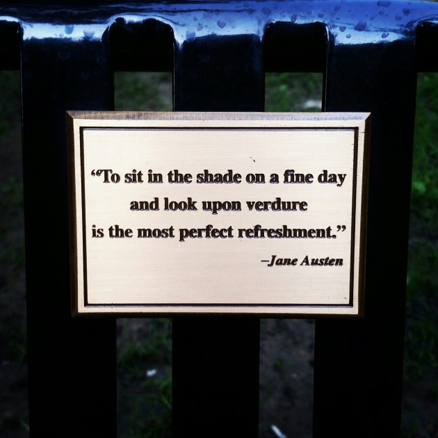
Eventually I succumb and put the phone away, defeated. Next time this happens, I hope that I dig out pen and paper and write a letter about it. Perhaps I’ll even do so in a park under a tree. I know of a bench that has a metal plaque with the apt quote: “To sit in the shade on a fine day and look upon verdure is the most perfect refreshment.” Yes, those are indeed Jane Austen’s words. Who better to inspire a letter?

We’ve been phasing out pennies for quite a while now, the pretty ones and the dull ones, emptying pockets, purses and piggy banks. Cashiers no longer sheepishly hand over three or four into the hands of sighing customers. Gone are the Have a penny? Give a penny. Need a penny? Take a penny. containers where we pooled our resources with strangers to avoid inconveniencing those in queue behind us.
It’s an efficiency, for certain, ridding ourselves of those cumbersome coins that cost too much to mint. Instead, we have an abundance of bright and shiny nickels to create a more satisfying plink into tips jars, their actual consequence disguised by volume in a deep sea of bulky silver.
Our rounding up and down for cash transactions is slowly but surely influencing other areas, too. Retailers are overhauling pricing strategies, because ending with an eight or a nine to evoke the sense of a bargain is passé in our penniless society. Things are mostly rounded up, of course, and not just for cash transactions. I pay exactly $2.00 for a certain kind of coffee in a certain size of cup, regardless of whether the transaction occurs by cash, credit, debit, gift card or e-card. It used to be nifty when that happened “by surprise” at the till – when the all-in price was an even dollar amount. Now it means I’m paying more. And I’m paying more attention as well.
On another score, math homework about counting and currency has yet to catch up. Sketches of pennies still abound in exercise hand-outs representing the ones. “Sweetheart, that’s a penny. It equals one cent. Yes, they still exist but we don’t really use them anymore. This exercise must be from an old textbook.”
Oh, I know, it’s just a penny, right? I admit that I’ve regarded them with disdain, too. But I miss them just a little, for their metaphorical and poetic value, if nothing else. They used to buy someone’s innermost thoughts, rained down from heaven, and brought good luck when you happened upon them. These things were worth something in terms of sensibility, if not cents ability.
You can still rub two Canadian pennies together if you can find them, perhaps at the back corner of the kitchen utility drawer with the rubber bands and transparent tape. Their presence, though fading, is actually less tarnished in memory because of the sentimental yearning for a time when a handful of pennies actually bought something. If I find a penny on the sidewalk now, you bet your bottom dollar that I pick it up. There’s still a bit of magic in the whimsy of a wish – the copper-hued, tactile promise of a better day.

